Statistical modelling Part 2
This is a static version of the learnr tutorials for the Statistical Modelling practicals.
Practical outline
Welcome to Part 2! We will continue where we left off in Part 1 and progress through a workflow of conducting an experiment and analysing data.
We will explore two types of statistical modelling – using linear regression (empiric model) to parameterise our function response model (theoretic model).
Learning objectives:
- Know how to parameterised a linear regression in R with biological data
- Know how to use linear models to predict new values
- Know how to interpret linear regression output to test hypotheses
- Know what to include in a results paragraph
- Know how to make a graph in R with appropriate labels and caption
We have covered all of these concepts in the lectures or previous practicals. This prac will reinforce and revise these concepts and allows you to practice them under supervision of the demonstrators.
There are two activities:
A step by step recap of the lecture content and the practicalities of linear regression in R using an example dataset. Work through the coding exercises and answer the questions in order.
Testing your understanding of the content by applying what you’ve learnt from the example to the data you collected last practical. This is the assessment.
Don’t forget to answer the CA questions in a separate link. There are prompts that will tell you when to answer the questions. The demonstrators aren’t allowed to help you answer the CA directly but they can help you understand the theory parts so that you can answer the CA.
How to problem solve
We don’t expect you to be expert programmers but we do expect you to be able and willing to figure things out yourself (problem solving).
In programming, it’s really easy to make mistakes that breaks code. That is no means a reflection on you or your ability to code/learn.
If your code is not working take a moment to breathe. Then check for common, minor errors such as:
- Spelling mistakes
- Wrong dataset name
- Wrong variable (column) name
- Missing or wrong quotation mark
- Missing bracket
- Inconsistent cases (e.g. Uppercase)
- Missed a step
- Invalid syntax (e.g. spaces)
- Duplicates of the same function with multiple errors – keep your scripts tidy!
These reading/typing mistakes are the majority of encountered errors. They are not a big deal and are easily corrected.
You can and should easily fix the above mistakes yourself!
We want you to know how to work problems out independently.
Be clear about your problem
Programming requires a clear idea of what you want to achieve.
You need to do the thinking for the computer.
One of the hardest thing about troubleshooting someone else’s programming is that we cannot read your mind. When describing your problem, be comprehensive & give context. The more information you provide, the more information and context people have to help you.
If something isn’t working, can you articulate what you aim to do? What you expect to see if it worked? What you did leading up to this point? And what you think is happening to cause the error?
This is called the rubber duck method – like you are explaining your problems to a rubber duck. Notice, it’s exactly like the Scientific Method.
If there’s an error message, read it. Error messages are the computer telling you what’s wrong. Try googling the entire error message to see what other people have said. The entire error message is necessary for context, not just the last bit.
Some general advice
Programming is trial and error. You shouldn’t expect to get it on the first try. And that’s OK – it’s part of the process.
You’ll often find it’s because you haven’t proof-read your code carefully enough for the mistakes above.
Practice the basics before you progress to harder stuff or answer the assessment. Take good notes.
Learning is about the process and about your growth, not the end result or your grade. Apply your knowledge to new scenarios.
Don’t over-think it.
Two pitfalls to avoid
Danger!
Do not take the code here for granted.
The point of learning computation and programming is to not treat software like a black box where you cannot see inside and you don’t know where the output came from or what they mean.
Every dataset is different, so code you copy from someone else is not guaranteed to work with your dataset first time. For example, you may be using different column names.
Think about what the code means and what it’s doing so you can make sure it’s appropriate and correct.
Do not skip questions or exercises to answer your assessment on the fly.
All the activities and quiz questions will give you the knowledge to do the assessment – do these first. Don’t do the assessment questions at the same time as the practical exercises.
Don’t stress yourself by attempting the assessment unprepared. Demonstrators are not allowed to help you answer the assessment questions.
Functional responses recap
Remember, in the previous practical we asked the question “How does prey density and foraging strategy affect the number of prey captured in a predator-prey scenario?”.
We have three variables of interest in our experimental design:
prey_captured: The response variable, continuous numeric variableprey_density: The first predictor variable, continuous numeric variableforaging_strategy: The second predictor variable, categorical variable with two sub-groups:no_lidandyes_lidfor whether the jar had a lid or not.
We derived a mathematical expression of a predator-prey interaction (Type II model) called a functional response by turning our assumptions about a predator prey interaction into mathematical equations. You can refresh your memory from vignette("functional_responses").
The Type II model looks like this:
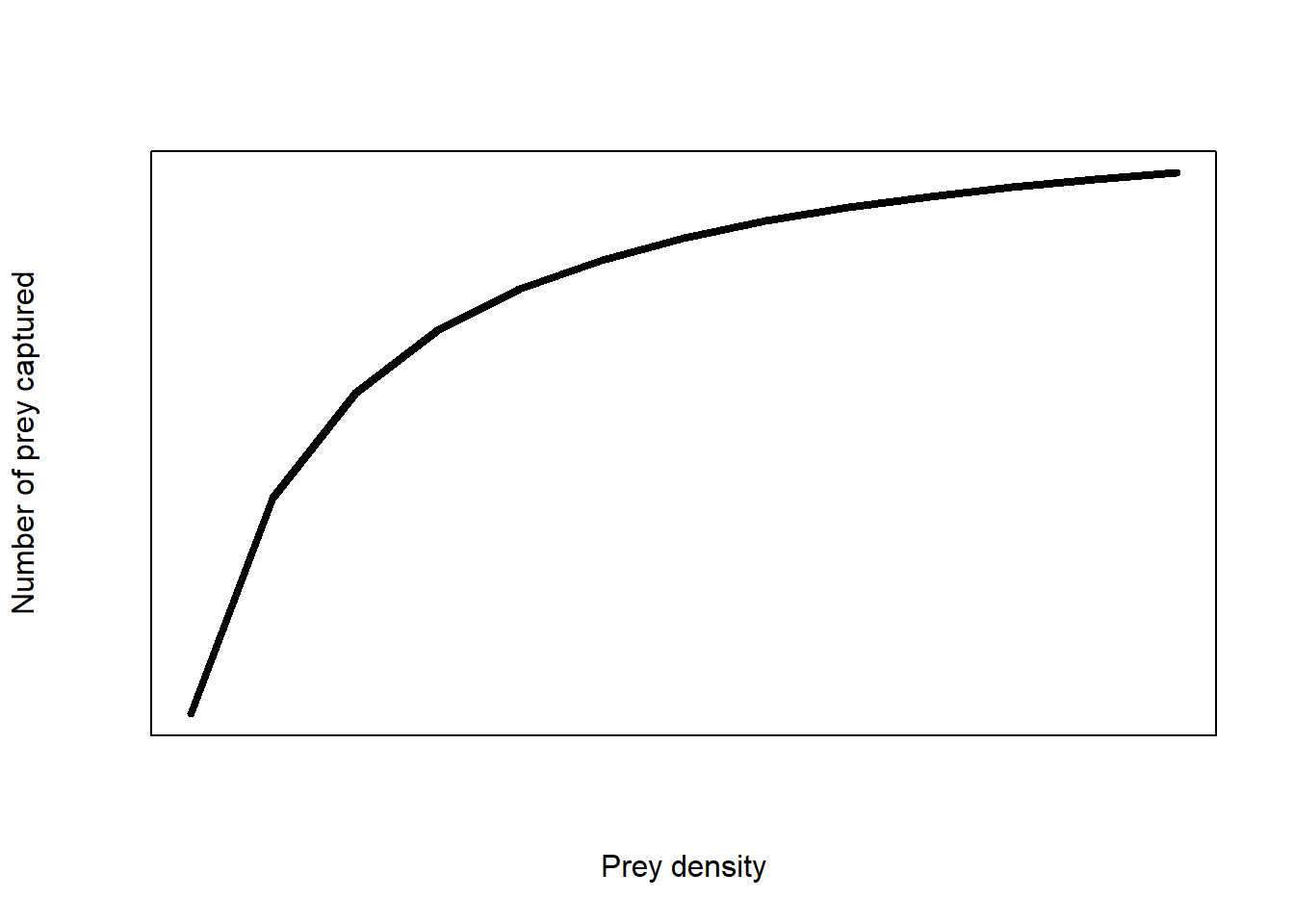
(#fig:funct_resp)Type II functional response of an predator-prey response
The equation of the model is:
\[H_a=\ \frac{a\times H\times T_{total}}{1+a\times H\times T_h}\]
The model is not linear.
The aim of the practical was to find the unknown values of search rate, \(a\) and handling time, \(T_h\) and we hypothesised that these values will change depending on the type of jar used (foraging strategy).
The process of estimating the value of unknown parameters in a statistical model is called parameterising.
Non-linear methods of parameterising these equations are beyond the scope of this module. But we can use algebra to make this equation linear and therefore we can use linear regression to get an estimate for the unknown parameters (see vignette("TypeII_models") to refresh your memory).
We then get a model:
\[\frac{1}{H_a}=\ \frac{1}{a}\times\frac{1}{H\times T_{total}}+\frac{T_h}{T_{total}}\] This model has the form \(Y = \beta_0 + \beta_1 X\) of a general linear model.
The graph looks like this: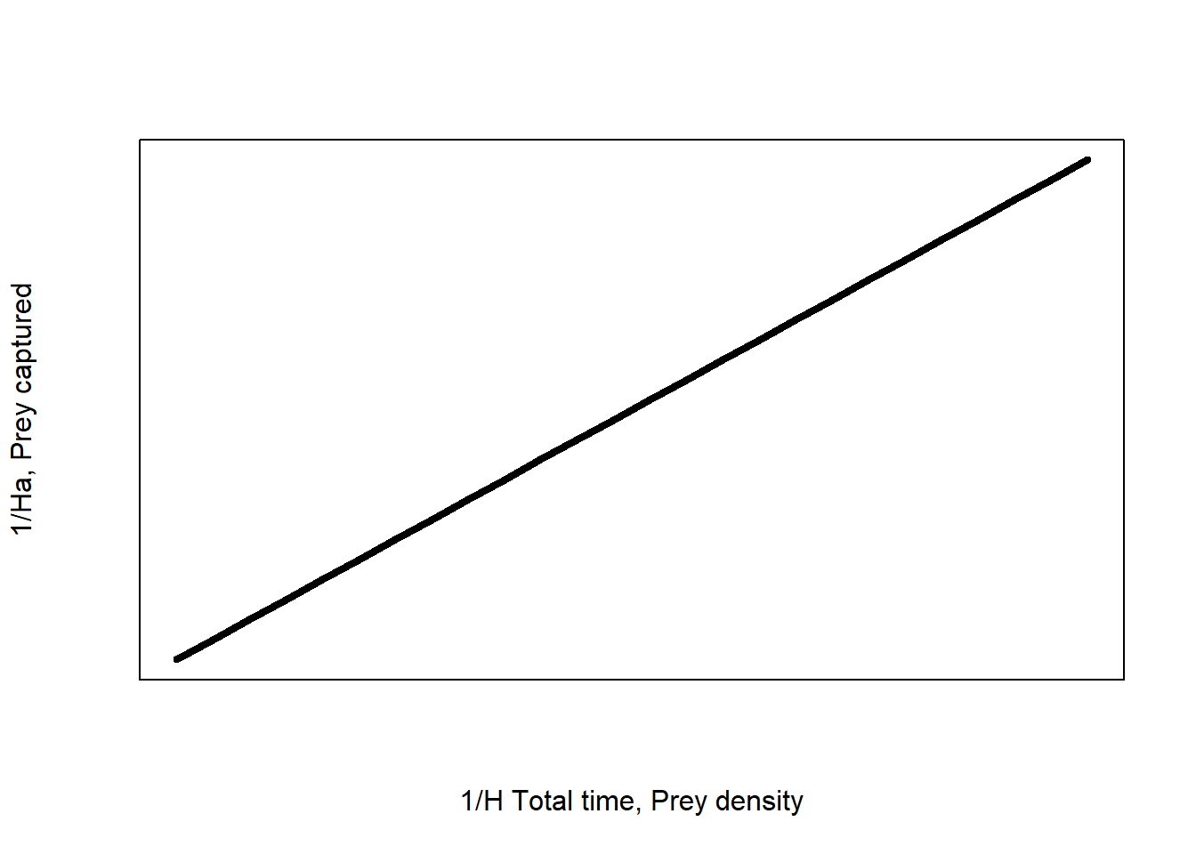
Figure 1: Linearised type II functional response of an predator-prey response
Now we can fit a linear model and find the values of search rate (\(a\)) and handling time (\(T_h\)) from the slope and intercept of the linear regression.
\[ \beta_1 = \frac{1}{a}\] and \[ \beta_0 = \frac{T_h}{T_{total}}\]
Which linear model?
Simple or multiple regression?
In the lectures, we saw that the structure of the appropriate linear model to fit depends on the characteristics of the data, the experimental design and the hypothesis. We looked at cases with one predictor variable (simple regression) and with two predictor variables (multiple regression).
If we did a simple linear regression with one predictor variable, we would have ignored foraging strategy meaning we have pooled observations for foraging strategy.
By pooling foraging strategy, any variation in the data generated by foraging strategy is unaccounted for. Unaccounted variation may increase our chance of making a Type I or II error because foraging strategy confounds the effect of prey density.
Phrased differently, the effect of prey density on numbers of prey captured is masked by the effect of foraging strategy. Thus, in this case, using a simple linear regression on a dataset with two or more predictor variables is not the best course of action for explaining as much variation in the data as we can.
If we want to see whether using a lid has an effect on our predator-prey interaction response, we need to include the variable in our linear model as well as our original predictor variable, prey density. We need a multiple linear regression model.
Plan ahead!
Confounding variation from doing a test that is too simple for the experimental design can drastically change the conclusion of the analysis! See Simpson’s paradox.
Additive or multiplicative model?
There are also two types of multiple regression: additive and interactive/multiplicative.
We could fit an interactive model to our data if we were more interested in finding a mathematical description of our data that explains the most variation in prey captured using the simplest model possible (model parsimony). So using multiplicative models are instead a statistical representation of the data, rather than a theoretic model.
Both are types of statistical models and valid in their own right but in this case an interaction doesn’t match the goals of constructing a theoretic model of predator-prey interactions from fundamental observations.
Foraging strategy determines the amount of prey captured but does not affect the number of prey present. And prey density determines the number of prey captured but does not influence the foraging strategy. This is based on our assumptions about the predator-prey interaction – the predator does not change foraging behaviour.
If the predator changed their foraging behaviour then there would be an interaction between the two predictor variables. This could be realistic. For example, animal predators might use different foraging strategies under different prey densities or they may switch to another strategy when prey density reaches a certain threshold. In fact, this is a Type III functional response.
Hypotheses
Info!
The wording of the hypothesis will dictate the appropriate linear model, statistical test, and our expectations about the graph.
Following the Type II model, the number of prey captured will increase with prey density until there are too many prey for a predator to handle and the number of prey captured will plateau.
Following the linearised Type II model, we expect a positive relationship between the two predictors.
We also had predictions about how foraging strategy affected the parameters of the Type II model – handling time and search rate (or attack rate).
Our hypotheses are:
H0: The number of prey captured increases with prey density but does not differ between foraging strategies
H1: The number of prey captured increases with prey density and is higher with the more efficient foraging strategies (shorter handling time) but the search rate does not vary
Discussion
How would your data look like to support these hypotheses?
Additive linear models
As we saw in the lectures, the theory behind all linear regressions is the same no matter how many predictor variables or interactions you have.
Variance in \(Y\) is partitioned sequentially and in alphabetical order (unless otherwise asked to) in R
To practice fitting linear regression in R, we will use the dataset crabs – see help(crabs) for more information. You can also check the data using str(crabs). This dataset is provided in R in the package MASS. I have already loaded the data for you within the tutorial so you don’t need to do it but you will need to load it via library(MASS) if you want to try code in a script. What happens in the interactive tutorial is independent of R’s Environment.
There are three variables we will look at (carapace is the zoological term for shell):
CL: Carapace length (mm) – our response variableCW: Carapace width (mm) – our predictor variablesp: Colour morph (BorOfor blue or orange crabs)
Info!
airquality has environmental data or the Penguins dataset about penguins can be downloaded as a package.
We can ask the question “Does the relationship between shell length and width differ between colour morphs?”. We can also phrase this as “Does the relationship between shell length and width depend on the colour of the crab?”.
Compared to a simple linear regression with one predictor variable (e.g. CW), this is a more complex question needing a more complex experimental design (two predictor variables) and thus a more complex statistical analysis.
Info!
“Bigger” crabs are expected to be larger in width and length so we expect a positive relationship between these variables. Whether this relationship is also dependent on the colour of the crab is what we can find out!
We don’t hypothesise colour morphs to influence carapace width, i.e. crabs don’t change colour as they get bigger, so an additive model fits with our understanding of the biological system (assuming the growth rate of both colours are the same).
It always helps to see a graph of the data:

The model
Mathematically, an additive model is:
\[Y = \beta_0 + \beta_1 X_1 + \beta_2 X_2 + \varepsilon\]
Where \(X_1\) is our first predictor variable and \(X_2\) is our second predictor variable.
\(\beta\) are the regression coefficients (also called terms) describing the variation in \(Y\) attributed to each source of variation. The additive model has three terms that are unknown to us: \(\beta_0\), \(\beta_1\) and \(\beta_2\). R’s job is to find the values of these coefficients from empirical data.
\(\varepsilon\) is the random error (residual error) not accounted for by the model – it’s always part of the equation but it’s often ignored, much like \(c\) in integration.
In additive models, the effect of one predictor on the response variable is additive or independent of the other.
There is no interaction between the predictor variables colour or shell width (i.e. \(\beta_3 = 0\)). Thus the two fitted lines have the same slope (\(\beta_1\)) – hence they are sometimes called fixed slopes models. The model is described as a “reduced” model because it does not contains all possible terms – all predictor variables and all possible combinations of their interactions.
Interactive models are considered “full” models if they contain all interactions in a fully crossed design.
To estimate the \(\beta\) coefficients, the ordinary least squares regression splits the dataset into its predictor variables and fits a model to each component – this is called partial regression.
The goal is to assign as much variation in the data as possible to each predictor variable. This process requires a baseline variable that sets the contrast for assigning variation (i.e. what \(\beta_0\) represents).
Dummy variables are used with a categorical predictor to set the baseline for the ordinary least squares regression. Since Blue is alphabetically before Orange, Blue is the baseline contrast used in the partial regression process and assigned the dummy variable 0 in crabs.
Thus for a blue crab, the dummy variable is 0:
\[CL = \beta_0 + \beta_1 CW + \beta_2 sp \times 0 + \varepsilon\]
simplifies to \(CL = \beta_0 + \beta_1 CW\)
An orange crab gets a dummy variable of 1, thus: \[CL = \beta_0 + \beta_1 CW + \beta_2 sp \times 1 + \varepsilon\] becomes \(CL = (\beta_0 + \beta_2) + \beta_1 CW\)
In effect, we are fitting two lines to this data – one for each sub-category of colour. The technical term for each of these lines is a partial regression line. We can generalise these regression lines as:
\[ shell \space length = \beta_{0_{colour}} + \beta_{1} shell \space width + \varepsilon\] Now the intercept parameter (\(\beta_{0_{colour}}\)) specifies that it is dependent on the colour of the crab as we showed above: \[\beta_{0_{Blue}} = \beta_0\] \[\beta_{0_{Orange}} = \beta_0 + \beta_2\]
Characters or factors?
Categorical data is are called factors and the sub-groups are called levels in R
Because R needs to attribute variation to every sub-group, the order of the subgroups is relevant. R shows you the difference between levels of a factor (\(\beta\)). The default order is in alphabetical order of the levels.
This is relevant to the experimental design too. It may be helpful to think of the first level of a treatment and the first intercept (\(\beta_0\)) and slope estimate (\(\beta_1\)) as the control of your experiment because R uses these coefficients as the baseline for hypothesis tests.
For example, the jar without a lid treatment is coded as no_lid and the jar with a lid treatment is coded as yes_lid. We can also think of jar with a lid as our experimental control (a less efficient predator) and the jar without a lid as our experimental treatment (a more efficient predator). Our “control” group (yes_lid) is alphabetically after no_lid, so we have the reverse scenario.
Remember!
The order will affect how R parameterises our model. And thus will change the interpretation of the output! But not always the conclusion.
By default, foraging strategy is classified as a character vector because it is a field with strings (letters). Characters do not identify sub-groups thus there is no structure to this variable – they are simply a vector of strings.
Info!
To fit a linear regression, R converts the foraging_strategy variable from a character vector to a factor and the order of levels is assigned alphabetically. R will use no_lid as the baseline contrast for \(\beta_0\) and \(\beta_1\). We just need to keep the order in mind when parameterising.
We will not do anything about this for now – in this case, it doesn’t change our conclusions.
Info!
If you needed to change the order of the sub-groups you will need to change the variable to a factor (as.factor) and define the order of levels using levels:
data$var <- as.factor(data$var, levels = c("level1", "level2").
yes_lid as the baseline (\(\beta_0\) and \(\beta_1\)) and the dummy variables are reversed but the parameterised model is the same.
Fitting the model in R
An additive linear regression in R with two predictor variables follows the general formula:
lm(Y ~ X1 + X2, data)Where:
X1&X2are the two predictor variables+indicates the relationship between the two predictors: a plus sign for an additive relationshiplmstands for linear modelYis our response variabledatais the name of our dataset~indicates a relationship between our response and predictor variables
In crabs, our response variable is CL and our predictor variables are CW and sp.
Did you get some output when you ran the model?
It should tell us two things:
- Call is the formula used. It should be the same as the linear model code
- Coefficients are the estimated coefficients of the model. There should be three coefficients called
(Intercept),CW&spO. From left to right they are: \(\beta_0\), \(\beta_1\) and \(\beta_2\).
We can already substitute the estimated \(\beta\) coefficients into the full expression of the linear model \(Y = \beta_0 + \beta_1 X_1 + \beta_2 X_2 + \varepsilon\) for the crabs dataset as:
\[CL = -0.67 + 0.88 CW + 1.09 sp + \varepsilon\]
But let’s look at the coefficients in more detail starting with the first two coefficients. The interpretation for these coefficients is the same as simple linear regression. There’s the intercept (Intercept) (\(\beta_0\)) and there’s the slope CW (\(\beta_1\)).
Info!
CW because it how much shell length changes with shell width.
Remember we are expecting two lines in our model – one for blue crabs and one for orange crabs.
Parameterising our partial regression model
Because the first two coefficients are for blue crabs, we already have our equation for blue crabs with \(\beta_0\) and \(\beta_1\).
Parametrised equation for blue crabs:
blue crab shell length = -0.7 + 0.9 shell width
Halfway there! Now for the orange crabs!
Since we expect the slope of the regression for orange crabs is the same as blue crabs, we already know the value of \(\beta_{1}\) is 0.9. But we need to manually calculate the intercept for orange crabs.
The estimate for spO is \(\beta_2\), which is the difference in the intercept between orange crabs and blue crabs. Or the additional variation in shell length attributed to colour, while pooling for shell width.
To calculate the intercept for orange crabs we need to add the estimated coefficient of the intercept for blue crabs (\(\beta_0\)) with the difference (\(\beta_2\)): \(\beta_{0_{Orange}} = \beta_0 + \beta_2\).
Now that you know how to parameterise the linear regression for orange crabs:
(Intercept)          CW         spO
       -0.7         0.9         1.1
You should be able to parameterise the linear model for orange crabs.
Info!
R shows the difference between parameter estimates so you need to calculate the correct values. They are the partial regression coefficients that show the change in the response variable with one predictor variable while holding all other predictor variables constant.
For example, using the mean value of orange crabs to estimate coefficients of blue crabs and vice versa, because the mean value of each of these groups represents the null hypothesis.
In other words, if we were to accept the null hypothesis that there is no relationship between shell width and colour on shell length, then the slope of the line should be 0 and the intercept of the line should be the sample mean of shell length (ignoring shell width and colours).Predicting new values
One application of statistical models is to make predictions about outcomes under new conditions
We can calculate the value of the response variable from any given value of the predictor variable.
For example, we can use the parametrised equation of our model \(CL = -0.7 + 0.9 CW + 1.1 sp\) and the dummy variables 0 for Blue crabs or 1 for Orange crabs to work out the length of a crab for any value of shell width.
If a blue crab is 10 mm wide, what is its predicted shell length?
- We are told the value of shell width (10 mm)
- We know the parameterised linear model:
\[CL = -0.7 + 0.9 CW + 1.1 sp\]
- We can substitute the value of 10 for CW:
\[CL = -0.7 + 0.9 \times 10 + 1.1 sp\]
- We know the dummy variable for blue crabs is 0 because it is the baseline level (assigned alphabetically) so we can substitute that into sp:
\[CL = -0.7 + 9 + 1.1 \times 0\]
- and solve for length:
\[CL = -0.7 + 9\]
\[CL = 8.3 mm\]
Or we can use our two partial regression models to predict the shell length of blue or orange crabs.
Blue crab shell length = -0.7 + 0.9 shell width
Orange crab shell length = 0.4 + 0.9 shell width
You should now be able to:
- Use the model to predict the carapace length of a blue or orange crab for a given carapace width.
- Use the model to calculate the difference in carapace length between blue and orange crabs for a given carapace width.
Evaluating hypotheses
Remember that statistical models may represent hypotheses
Here are the hypotheses:
H0: Carapace length increases with carapace width but does not differ between colour morphs
H1: Carapace length increases with carapace width and differs between colour morphs but the rate of size increases does not vary between colours
We can test these hypotheses using the linear regression. It’s important to understand these hypotheses graphically. Look at the following graphs:
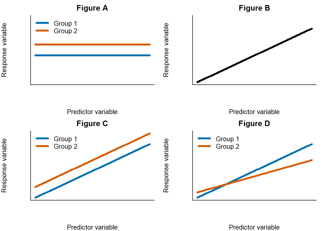
Question
- Which of the graphs above represents the null hypothesis about crab size?
- Which of the graphs above represents the alternative hypothesis about crab size?
Notice how the slopes of all the lines are the same. We expected this based on the additive model maths.
We want to know if the lines have different intercepts to each other. Phrased differently, we need to test whether the difference in the intercept is different to 0.
We could have more hypotheses that also test whether there is a positive relationship in the data or not (i.e. is the slope = 0?) but the specific wording of our hypotheses above do not do so.
We don’t just need to know the difference, we need to statistically test this; whether an estimated/observed value of a sample is significantly different to a known population value. You’ve learnt about this kind of test already.
Question
- Can you remember which coefficient in the additive model will test this hypothesis?
- Which of the statistical tests you’ve already learnt in this module would test whether our observed slope is significantly different to 0?
Remember!
Statistical significance is not the same thing as biological significance.
A relationship between two purely randomly generated numbers can be statistically significant but have no biological meaning. A biologically meaningful relationship can be statistically non-significant.R automatically tests the following hypotheses as part of lm:
H0: The difference is equal to 0
H1: The difference is not equal to 0
To see more information about our linear regression we need to ask to see the summary of our linear regression by placing our lm function within summary(lm()).
When you run summary you get a lot of information. Let’s break it down from top to bottom:
- Call is the formula used to do the regression
- Residuals are the residuals of the ordinary least squares regression
- Coefficients are the estimated coefficients we saw earlier plus the standard error of these estimates, a t-value from a one sample t-test testing whether the estimated coefficient is significantly different to 0 and the P value of this t-test
- Some additional information about the regression at the bottom which we can ignore for now
From the output you should be able to:
- Identify the correct t-statistic
- Make an inference about the one-sample t-test
- Accept or reject your null hypothesis
Info!
The one sample t-test is done on each coefficient. The hypotheses are the same. The test can also be phrased as “Does the coefficient explain a significant amount of additional variation in \(Y\)?”.
For example, if we ran a multiplicative model with a \(\beta_3\) term, then the t-test will determine whether there is an interaction or not. If the t-test was not significant, then the interaction does not explain more variation and an additive model without an interaction is more appropriate. This is an example of model selection.Putting results into sentences
Statistical analyses need to be interpreted into full sentences, within a results section
Always place your statistical analysis into the wider context of your hypotheses and aims. Demonstrate your understanding by justifying your choices and interpreting the output.
ANOVA tables should be nicely formatted in a proper table with the correct column names. Don’t copy directly from R as is.
When reporting summary statistics, describe an average with a measure of spread. You need to give a sense of the distribution of points so means on their own are not that informative. Include the range or standard error or standard deviation. E.g. “Mean carapace length was \(32.1 \pm 0.5\) (mean \(\pm\) standard error)”.
Be comprehensive!
R output should not be presented as a figure or screenshots. Do not copy and paste directly into a report – this output is meaningless to a reader because they do not know your data or your workflow like you do.
P values should never be reported on their own – they are also meaningless without the test statistic and degrees of freedom used to calculate them. P value of what?
A results sentence needs at a minimum:
- The main result
- The name of the statistical test
- The test statistic and degrees of freedom
- Df can be written as a subscript to the test statistic (e.g. \(t_{14}\)) or reported as df = 14
- F statistic need the degrees of freedom for the within & among error. E.g. \(F_{1,25}\)
- The P value
- Really small or large P values can be summarised. E.g. P < 0.001. Don’t write out many decimal places
- Reference to any relevant figures or tables
All the above information is given to you in summary or the ANOVA table. The degrees of freedom of a linear regression are found at the bottom of summary (Residual standard error).
A sentence does not need to include significant in the wording. Statistical significance or not is already implied by the wording of the sentence and the inclusion of the P value. The term can also be ambiguous in meaning.
Danger!
There are many ways that P values can be biased or manipulated to give small or large values.
People’s obsession over getting significant P values has driven a rise of unethical statistical practices (called P hacking or P fishing) which we do not want you as scientists in training to fall into the habit of.
The point of statistical testing is to understand trends in data. Not to get a significant P value. Null or non-significant results are valid results.Check any published scientific paper to see how they’ve reported their results. Or any guide to scientific writing.
Practice: Exploring a Type II functional response
Remember we had some unknown parameters in our predator-prey functional response model? The search rate, \(a\), and the handling time, \(T_h\). We need to find the value of those parameters from the slope and the intercept of our linearised Type II dataset – exactly like we did for the crabs example. We can use the lm function on our predator-prey model data to parameterise our model.
Before we can do our lm in R we need to import the data and linearise the data.
Step 1: Importing data
First, we need to import the data in to R. This should be familiar to you from before.
Warning!
Don’t use the code chunks in this tutorial to import data, it won’t work. Make your own script (File -> New Script, or Ctrl(Cmd) + Shift + N).
Don’t write your code directly in the console either – you won’t have a good record of what you’ve done and it is harder to troubleshoot. You may want to use the code here to help you with your final report or future projects.
If you copy the code in this tutorial, make sure to modify it as appropriate for your data.The examples here use mathematical notation as the variable names here but the class dataset uses the names from Part 1. You should know which notation matches with what variable description.
The class dataset is provided as a comma separated values file (.csv). The function to import a csv file is read.csv:
class_data <- read.csv("directory/folder/class_data.csv")This imports the spreadsheet into an R object called class_data but you can use whatever name you want. You need to replace the file address within the quotation marks with where ever you saved your file on your computer. File housekeeping is important!
Remember!
Make sure you adapt code to match your dataset. Don’t take code for granted!
Step 2: Linearising data
We need to make our data linear to fit a linear model to it! Let’s first take the inverse of our response variable \(H_a\) to get \(\frac{1}{H_a}\)
class_data$Ha.1 <- 1/class_data$HaThis line of code calculates the inverse of Ha, that is, 1 divided (/) by the number of prey captured (Ha), then saves that number to a new column in our dataset called Ha.1. Note the use of no spaces.
Your column names can be whatever is meaningful to you. E.g. you don’t have to call your new column Ha.1 but remember what you called it.
When manipulating data like this, it’s best practice to add new columns to the data, rather than overwrite the original column. That way, if you make a mistake it’s easier to see what went wrong and you won’t have to start from the beginning!
Remember!
data$column is the general structure to select a column in R. The dataset name and the column names in your code must exactly match your data name and columns. R is case sensitive.
Make sure you’re not making basic errors like using the wrong column name. Remember, problem solving is fundamental to coding.
Now let’s linearise the predictor variable (H) to get \(\frac{1}{H\times T_{total}}\).
class_data$HT.1 <- 1/(class_data$H * class_data$T_total)Because we use a value of 1 minute for \(T_{total}\), we are essentially dividing 1 by only prey density (\(H\)). Told you a value of 1 would make our maths easier!
Watch out!
Since we have done some division, it’s a good time to check for any undefined values in case we divided by 0.
In R undefined values are denoted as infinities (Inf). You can check how many infinities there are using table(is.infinite(class_data$Ha.1)) – this will check whether each cell has undefined values (is.infinite) and give you logical TRUE/FALSE output, then tabulate the logic statements to count the number of TRUE/FALSE occurrences in the column Ha.1.
We can replace the infinities with zeroes using class_data$Ha.1 <- ifelse(class_data$Ha.1 == Inf, 0, class_data$Ha.1)
We now have all the correct columns to parameterise our functional response.
Step 3: Construct an additive linear model for your data
If lm is the function to do a linear regression, Ha.1 is the name of our response variable, HT.1 is the name of the first predictor variable, foraging_strategy is the name of the second predictor variable, and the name of our dataset is class_data, you should be able to write the code for the linearised type II functional response (or replacing the respective components with the column name and dataset names you are using).
Hint
The workflow is exactly as we did for crabs – so you’ve practised it already! Remember that R partitions variation sequentially and in alphabetical order for factors.
If you didn’t understand the previous material or you got some questions incorrect or you skipped bits, I recommend finishing them before progressing. Demonstrators cannot help you answer the assessment.
Info!
Linear regressions are always done on the entire data, not on averages. i.e. you wouldn’t use the average of your replicates for each treatment for the underlying data. Data must be raw (unprocessed).
To fit a line to data, ordinary least squares regression depends on quantifying variation of observations around the mean (think back to how sampled data from a population is distributed). Averaging data removes that variation and thus there is less information for R to use (fewer degrees of freedom).We won’t plot our regression lines just yet but you should be able to interpret the R output as a graph by looking at the coefficient values. We will construct a graph later!
Step 4: Parameterising \(a\) and \(T_h\)
The final step is to get our unknown values of \(a\) and \(T_h\) for each type of foraging strategy from our linear regression. Since we know our partial regression takes the form \(Y = \beta_{0_{foraging \space strategy}} + \beta_1 X_1\) with separate intercepts for each sub-group of foraging_strategy and the same slope for both groups, and we know the linearised type II model is \(\frac{1}{H_a}=\ \frac{1}{a}\times\frac{1}{H\times T_{total}}+\frac{T_h}{T_{total}}\), then you should have all the information to parameterise the type II model and derive values for \(a\) and \(T_h\) from the linear regression output for both foraging strategies.
It’s time to answer the CA!
You have all the information you need to answer the CA.
Make sure you’ve completed all the exercise up to this point.
That’s the end of the assessment but not the end of the practical.
Keep going. You’re doing great!
Visualising data
Visualising data is very important for understanding our data and for communicating our data to others. For example, in a written report.
plot is the general plot function. Box-plots (boxplot) and bar plots (barplot) have their own plotting commands. You can add error bars using arrows.
Theory
The general formula to plot a scatter graph is
plot(response ~ predictor, data)
If our data is categorised (e.g. sp in crabs has B or O), then we need to plot our points for each group separately. We can do this by calling a plot with no points using plot(response ~ predictor, data, type = "n") where "n" tells R not to plot anything. Then we add points manually with points(response ~ predictor, data[data$group == "subsetA",]) for each sub-category.
We need to subset our data (like we did in previous pracs) so that R only plots the sub-categories of data.
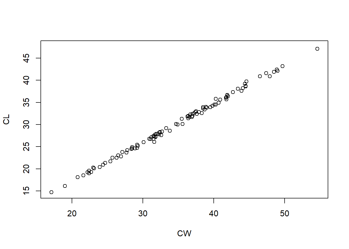
Using the crabs dataset, plot crab shell length (response) against crab shell width (predictor) for only blue crabs.
If you are correct, your graph should match the one below:
Now add the orange crabs to plot all the data – You have to start the code from the beginning.
Uh oh! We cannot distinguish between the colours of crabs! Time to learn more R to add more features to the graph.
Colours
Colour is important when presenting data. Are the colours meaningful? Are they necessary? Can they be clearly distinguished? Are they appropriate for screens, for printing, or accessible for colour-blind people?
Info!
Colour in R is defined by col. So in a graph if I wanted to change the colour of the points from black (default) to red then I can either call col = "red" or col = 2 as an argument within the points() function, because red is the second colour in the default R colour palette (black is 1). There are lots of colours to choose from (Google it for a full list). R also accepts hexidecimal RGB colour codes for custom colours (e.g. black is #000000).
Change the colour of the points to their relevant colour (blue or orange)
Shapes
Shapes are important because it makes the points stand out. It can also be used to distinguish between groups of data on the same graph. Sometimes it’s necessary to change colour and shape to make it easier to distinguish between groups – redundancy is acceptable and encouraged in graphical design.
The shape of the points are coded pch = <number> as an argument within plot() or points(). There are lots of options designated a number from 1 to 25. (Google “R pch” for the full list). 1 is the default open circle. A filled circle is 16.
Change the shape of the points from open to filled circles.
You can combine all the code above to change the colour, shape and axes labels.
This graph is fine but if we were to put this in a professional scientific paper or report there are a few missing elements and we may want to customise the aesthetics for a prettier graph.
Axes labels
The R code to change the labels on a graph are xlab and ylab for the x axis and y axis, respectively. These are called within the plot() function like:
plot(response ~ predictor, data, xlab = "label", ylab = "label")Change the x axis label of our crabs plot to “Width” instead.
In practice, we want our figures to be informative and be understandable independently of the main text. This means having informative labels and including units.
There are two mistakes in the following code to change the axis labels to “Width” or “Length” AND include units (mm) in both the x and y axis. Fix it and run the code
Regression lines
Once we’ve done the hard work to do a linear regression, it’s nice to add it to our graph so we can see how it fits to the data. A linear regression is always a linear line (straight line) so we can use the code to plot a straight line.
The formula to plot a straight line is abline(intercept, slope) because it plots a line from a to b. The intercept is the first value, the slope is the second value. You need to plot the data first before adding additional lines.
Here are the coefficients for a simple linear model for the crabs showing the intercept and slope respectively:
(Intercept)          CW
       -0.7         0.9
Complete the abline() formula to plot our regression line then press run.
The same code is used to plot either regression line for a multiplicative regression – you just need to use the slope and intercept values you want!
You can also change the colour, type and width of the line as arguments within abline().
lwd = <number>is line width. The default is 1. Values greater than 1 are a thicker line.lty = <number>is line type. The default solid line is 1. Different types of dashed or dotted lines are numbers 2 to 6.
A final graphing test
Let’s integrate everything we’ve learnt today and plot the graph of our additive linear model with the correct regression lines.
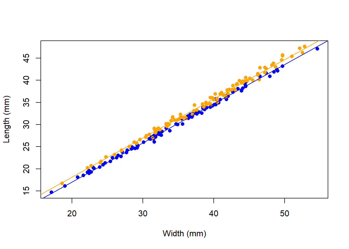
Figure 2: A complete graph for a scientific report
Here are the coefficients for the additive linear model:
(Intercept)          CW         spO
       -0.7         0.9         1.1
Change the basic crabs graph to match the graph above – this graph is suitable for a scientific report
Other variables in plot
Borders
A border around the plot is plotted by default. This is dictated by the default bty = "o". You can remove the border entirely with bty = "n" and you can plot only the bottom and right border (axes) with bty = "l" – that’s a lowercase L, not a number 1. Borders also apply to legends.
Legends
Figure legends can be added using legend. Check out the help file for details because you need to set:
- Where to put the legend
- The text of the legend
- The colours
- The lines or points used
Title
Figure titles can be set using main = "<title>". There are other ways of captioning figures too, like subtitles.
Lines
type tells R what kind of plot you want. R plots points (type = "p") by default but can also plot lines (type = "l"), [lowercase L]. You can plot a combination with type = "b.
lines is the equivalent to points for plotting individual lines.
Captions
The last thing every scientific graph needs is a caption. The caption needs to describe the graph and explain every aspect of the graph to the reader independently of the main text.
- What is the overall relationship?
- What is on the x axis? What is on the y axis?
- What is the sample size?
- What do the colours, lines or points represent?
Often a single sentence saying “Figure 1. A graph of the response against the predictor” is not enough information in a professional report.
Saving your graph
One way to save your graph is to click “Export” in the Plots window.
The other way is to use code:
png("figure.png")
plot(Y~X, data)
dev.off()
There are three steps:
pngtells R to prepare a png file where you want the graph to be saved. jpeg and pdf are also accepted formats.- Plot the graph
dev.offtells R you are finished plotting the graph and R will write the file to disk
Practice: Graphing results with a caption
Discussion
You can show your figure to your demonstrator for feedback.
End
That’s the end. Take a break. Stand up. Shake your limbs. Breathe.
We’ve covered a lot of practical skills that you can use in your final report, in the future and in your other modules. Just as you should build upon what you’ve learnt in previous modules in this one.
Here’s a summary of what we’ve done:
- Imported data into R
- Manipulated data in R, including cleaning
- Parameterised a linear regression in R with biological data
- Made predictions with linear models
- Interpreted linear regression output to test hypotheses
- Wrote a results paragraph
- Made a graph in R with appropriate labels and caption
Success!
Over the course of the last practical and this one, we have done a crash course in the Scientific Method from formulating a hypothesis from a biological system (infection or predator/prey response) to evaluating hypotheses and every thing in between.
We have followed a workflow of data handling analysis that you can apply to any data.Jacinta Kong
Postdoctoral Fellow
My research interests include species distributions, phenology & climate adaptation of ectotherms.